How to style your React application?
I built my first app. It works. Now how the heck do I go about styling it?
When building a React application, you get to a point where it is fully functional but it doesn’t look like you want.
We as developers focus on how things work, not on how they look. Until we realize that our little baby is ugly 😭 and then we start styling and resizing here and there to make it prettier.
But how the heck can we style all of them in a way that is efficient and makes sense?
The fastest way to style your React app
As you may be guessing, the fastest way to style your React app is by using a UI component library that do all the heavy lifting for you.
What the heck is a UI component library? Well, it is a set of ready-made UI components such as buttons, forms, dialogs, and so on.
When using UI component libraries, instead of playing with margins, paddings and sizes, you just use the components the library provides. It makes our lives easier because:
- It is faster than creating components from scratch.
- Less error prone: they already work and are tested.
- They look great without any extra effort from the developer.
- Established libraries are easy to use and have great documentation.
Using a library will save you time and your application is going to look awesome.
The next question is What UI library should you use?
There is not an industry standard when choosing a UI component library, but the commonly used are:
My personal choices are Bootstrap and Ant Design. Bootstrap for simple apps without many functionalities and Ant Design for the rest.
Why Bootstrap? I have experience building static sites with HTML + CSS + Bootstrap. So, I can leverage my knowledge in this framework with React.
Why AntD? Two reasons. The first one: the documentation is awesome. I rarely google AntD stuff when using this framework. The second reason is that it has MANY components. When using it, I feel like they have though in everything. Its magic.
MaterialUI documentation is pretty good too. But in my experience it is a bit harder to customize and I feel like all apps made with material design looks like Google apps. Which is not bad BTW, I just don’t like it.
I can’t say much about the rest because I haven’t used them. However, I know that they are safe bets and I’m personally open to experiment with them depending on the requirements of the project.
My final advice is: choose one that looks similar to what you want to accomplish. The more similar they are, the less time you spend on customization.
Color personalization: how to choose your App colors?
At some point in the project, you will realize that your app needs some personalized touch.
The low hanging fruit in UI personalization are the colors.
Most libraries have a theme system based on primary and secondary colors, you can change them easily.
The tricky part is choosing the colors. What colors should you use?
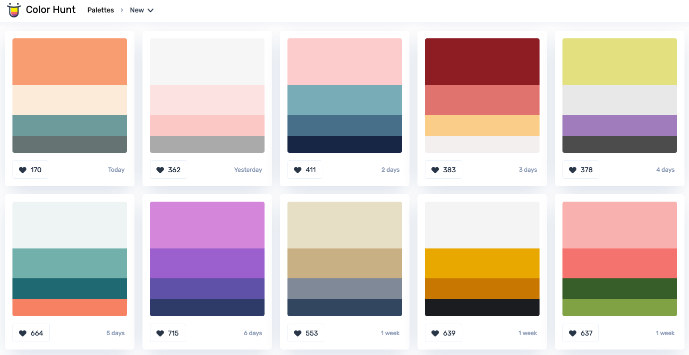
Given that my design knowledge is zero, I usually use a palette color tool such as colorhunt or coolors. Thanks to them, you can choose any one you like with visual inspection:

For example, for a Chilean Tax payment calculator I made, the colors I used were a variation of this palette:

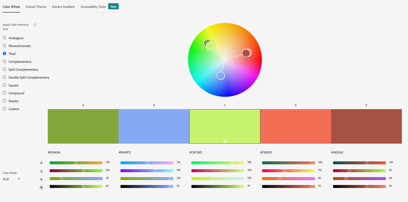
Sometimes you’re told about the dominant color. Maybe your boss told you so or maybe you feel that you should use a particular color.
In either case, you already know the main color, so you can use Adobe Color Wheel to get complementary colors that looks nice with your choice:

Personalization is not all about colors
Sometimes you will have to make a component and styles by yourself.
There are many ways to add styles to your React components. See How to CSS Style in React for a good summary of the approaches.
I usually start with inline style until I feel it is not good. My next step is to use css-in-js with react-jss. This approach works well because when using UI libraries, custom components tend to be self-contained.
If you’re having troubles maintaining your styles, you could try to use another solution. Maybe Utility-First-CSS is right for you. One of the popular approach here is Tailwind CSS.
If you’re having trouble distinguishing the different strategies, check How to CSS Style in React post.
And lastly, when creating your own components, check 7 Practical Tips for Cheating at Design to avoid common design mistakes.
Where to look for inspiration?
Let’s say you’re building an app that needs a chat and that your UI component library doesn’t have components for it. How do you know how it should look like? Where can you get design inspiration?
If you’re like me, creating a component based on a design is the easy part. Figuring out the design is the challenging part. Especially when you don’t have a designer on your team.
When I’m lost, I usually go to Dribbble for inspiration. Or I look at the apps I already use.
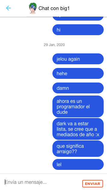
For example, early in this year I was building an app with Chat functionality. The choosen UI component library was Ionic because it looks good on mobile. The problem is that Ionic doesn’t have componenets for Chat.
After looking for inspiration in Dribbble (this one) and on the apps I use (Facebook Messenger) I ended with this:

Final notes
In summary:
- The fastest way to make a good-looking React app is by using a UI library. Choosing a popular one is a safe bet, so choose one based on what you are going to build.
- The low-hanging fruits in personalization are colors. To choose a good set of colors, you can use Color Hunt.
- When the UI framework is not enough, you’ll need to make a custom component from scratch. You can use tactics to improve your design and you have many choices to style it. Lacking of ideas? Use Dribbble for inspiration.
Bonus: just found Design Resources for Developer in GitHub, looks awesome!